Saturday, 8 February 2020

Level Three What is my kaupapa - exemplar blog post

I think most of you AVOIDED blogs last year, or did the bare minimum when pushed. 

Your labels will be added as you write your first post like this. These labels will be five in total and you will be expected to use at least two each time you post:


3.13.23.33.4(folio) and Art 2019. The following is an exemplar of what your first blog should look like in a total of 150 + words:


Make sure you answer the following in your post:


1) What is your field? 
2) Why are you working on this field
3) What well last year? what didn't go so well last year?
4) What are you planning to do differently?
5) What have your two brainstorms revealed so far? (add a photo of both of them)
6) Why did your teacher get you to make a digital mood board? (download it as a JPEG and insert it here too)
7) Identify something that is new to you from completing the mood board - like knowing about a particular artist for instance and making a connection now, to your kaupapa that is forming.
8) Who are the three artists (one from each of contemporary, traditional and Aotearoa) have you chosen? (insert TWO art images from each artist,  with name, date, media)
9) Why have you chosen these three artists? 


The above will form a paragraph that is an introduction. It outlines my field choice for the year and explains why you have chosen your theme to base your kaupapa upon. 


Before you publish, spell-check, get a friend to read it through and ADD labels, which you will make under the word labels on the right-hand side:


Friday, 22 November 2019

Level two - what is my kaupapa? Example blog for 2020 to start you off.

I think most of you got the idea of the blogs by the end of the year and we have some great examples of blogging by the time you did. However, we want to start great and finish great this year. 

Your labels will be added as you write your first post like this. These labels will be five in total and you will be expected to use at least two each time you post:


2.1, 2.2, 2.3, 2.4(folio) and Art 2019. The following is an exemplar of what your first blog should look like in a total of 150 + words:


My Visual Arts course this year will be focussed on painting (or photography or design, you choose this bit and adjust). I enjoyed painting last year because I felt like I could do it easily/is a challenge for me/will be the most useful tool to help me express my ideas/is a passion of mine (this is your thoughts, not mine, and there is no real wrong. But, here may be the odd cop-out, which we would rather not have). My kaupapa for the year will be based upon spiritual and cultural development. This is something that interests me because my family lineage is so mixed and generations back of my family denied a great deal of their own history in order to fit into pākeha dominated culture. I felt like it would be something that I could work on for an entire year.


The above paragraph is an introduction. It outlines my field choice for the year and explains why I have chosen spiritual and cultural development to base my kaupapa upon. So far, for my actual 'post' as a student, I am at 111 words. 

I have gone through the artists in my theme from the matrix on Ako and created my mood board here:


From here, I have decided on Mick Namarari, Faith Ring gold and Robyn Kahukiwa as my artist models for 2.1. These artists will also help me get started with 2.2 which is also going ot be the start of my folio.

I have just copied and pasted these artists off the matrix, which keeps the hyperlinks intact for my post. 

My kaupapa based on this theme is looking like this:

 (Image of the brainstorm you will do in class inserted here). 

Typed words at this point are 184. However, when you take into account what you will have on your brainstorm it is likely to be closer to 250. 

(a summing up of what is on the brainstorm here will be useful)


Tuesday, 12 November 2019

Level One Art What is my Art Kaupapa? (Level one example first blog post)

This is an example of what your first blog post for 2020 should look like. Its the BASIC version. I am imagining that I am a Level One student while I write this. Anything in green is meant to help you better understand what it is I am doing. 


This year I will be focussing on Feminism and Equality as my kaupapa.

I have chosen this theme because it is something I identify with as a woman and as someone who feels strongly about just practices in our community.

The media I will work with are Paint and Design.

The two artists I have selected for 1.1 are: Lisa Reihana and Sofia Minson from list one, and Banksy and Shepard Fairey from list two.

Insert your Moodboard here. Make it (it will have 39 Artworks on it) and then download it as a JPEG. Inserting it into your blog from there should be easy. 

(Here is exactly what I mean for this, don't include this part in your blog, this is just to explain to you... I went to the AKO matrix for level one and collected up my Artist model mood board. Then I was able to clearly state that I was looking at the artists I have listed above. )


:
This is the matrix from the AKO section of our site. You MUST choose two artists from list one, two from list two and then one other from the third lists for 1.2 and 1.4. A total of five artists). 


The artist I am interested in for my kaupapa is John Heartfield.

Here are my notes about my thinking for my kaupapa:

(photo of your brainstorm here)

I want to use self-portraiture from selfies, river stones and lego pieces as my subject matter. I think I can show meaning and visual metaphors for my ideas with these three things.

This amount of writing is 130 words. It is the first post. It sets the scene. If you do only this much, you have reached our target. Add Labels on the right-hand side as clearly explained already! EVERYTHING needs to have at least 2 of those 4 labels this year. 

Saturday, 8 June 2019

Year 10 progress on double page spreads (DPS)

Kia ora koutou

I have updated the site with another screencastify of good and bad DPS, and hopefully, you all have a handle on clipping masks and using the opaque/transparency function.

A couple of things I covered with individual groups during the lesson were:

themes; what is your basic theme? does your design represent it? Te puna auaha - spring of creativity. can I see anything that visually represents this? if not, what can you do about that? Does your font relate to your topic you are writing about? And with Molly, Natasha and co, what can you take from Wassily Kandinsky and Tchaikovsky to your work?  That was a big leap by the way.

For any of you who are interested in going off on a tangent; Kandinsky had synaesthesia. It means he would hear stuff and then see shapes and colours in response to what he heard. It is very rare.

Kandinsky, who was from Russia, loved art and music.


Tchaikovsky was a highly passionate composer of classical music and he was also from Russia:


The richness of the layers in the music lends itself well to how a synaesthetic artist could work. 

A modern day version of this kind of composer would be Freddie Mercury. I wonder what would happen if someone drew and painted to the music of queen in a similar manner? 

Once downloaded, there are a couple of videos of our lovely senior voices with soul vocalists I will share that illustrate the layers and complexity of the music, which would translate beautifully into art if someone chose to do so. 


Wednesday, 10 April 2019

Year 10 orphism and lino printing

Kia ora koutou

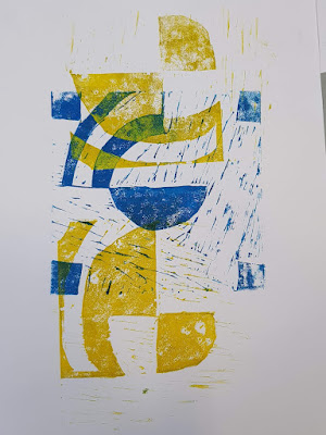
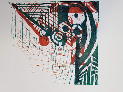
Today I showed you how we can print these two blocks to create colour layers and interesting effects.

The key points we are covering are:

- registration
- transformation
- rotation
- repetition
(these are all mathematical terms too!)


The first point to think about is colour choice. Eventually I want lots of experimentation from you, but to begin with, choose one contrasting colour pair to work from. 

When I showed you printing the first one which was"registration", I blotted the purple before I printed the yellow over top. After experimenting, I am recommending that you DON'T do that, print wet on wet, as it gives another effect to your work that might be more interesting.


This is done with hand printing (not a press). We use a metal spoon to burnish the back of the paper until the print comes through. You need to be patient and careful not to slip. The spoon will heat up because of friction, slow down when that starts to happen. 

Registration:

Rotation:

Transformation:

Repetition:


Everyone needs to be printing by Friday, please don't forget your plates and tools for tomorrow. 


Friday, 5 April 2019

Painting in acrylic technique

Kia ora koutou

On Friday we worked through an exemplar 'how-to' in acrylic painting.

Acrylic is different to watercolour. Watercolour should be watery. Acrylic should be strong and layered.


Key technique points:
- Start with a very basic pencil sketch - no tone, light lines.
- Key in base colours in thin watered down paint - preferably use a clear gel medium to thin the paint down.
In the cupboard above the sink. Don't use heaps, just a little.

- Use colour theory to sort your base colours - cool tones look far away, warm tones look closer to you. You are an illusionist with painting. 

- Once you have your base colours down, then you need to determine where the lights are and where the shadows are. NEVER use black paint at this point. If you really need it, use it at the end of your painting process, to strengthen the darkest areas only if necessary.

- To mix a 'block' colour or dark shadow colour, look at the paints you have and select the darkest hues from opposite sides of the colour wheel and a tiny bit of yellow. That will usually result in a good dark tone. 

You don't need every colour in the universe on hand to paint, just the basics: red, yellow, blue, a nice clear purple helps (or magenta) and white. 


Build your paint up and paint with thicker paint than you would if you were using watercolour. less water and less paint is actually what you need. too much paint and you wont be in control. Same with too much water. 

You will be looking to build up careful layers, so if it's not quite right, so long as you haven't used too much paint underneath, you should be fine:


On Monday and Tuesday, we will work through a couple more painting exemplars and add to this resource too. If you want to keep practising basic shapes like this, remember to KEEP all your attempts as they are NCEA evidence for 1.2, 2.2 and 3.2. 


Wednesday, 3 April 2019

LINO CUTTING FROM YOUR ORPHIC THUMBNAIL SKETCHES:


1) Our learning outcome has been:
to develop an understanding of Sonja Terk Delauney, Orphism and colour theory through lino cut printmaking. We should also be cementing our understanding of leading lines and focal points in completing these.

2) Our techniques we have been using have been: Practical knowledge research drawing of terk Delauney's work.Understanding context and Communicating and Interpreting: research information on Terk Delauney on our blogs. Developing Ideas: Thumbnail sketches with colour and annotations, refinement of an idea in colour with annotations. Practical Knowledge: lino cut mark making - two layer plate from one design.

3) The evidence you can provide would be photographic - your work pages to date and your lino plates as they are right now.

4) What worked: completing thumbnail sketches in front of you and explaining leading lines and focal points as I went. I would do this more next time in teaching you. What didn't work: not having a lino print ready to show you before you started the thumbnail sketches, as I think that messed with your heads a bit when I then said take one design and turn it into two plates.

I believe you have a good understanding of the geometry and play with shapes required to achieve the look we are going for with Orphism. Many of you connected really well about making focal points and leading lines a reality in your pieces. i will be working more on colour theory with you next week.


The five paragraphs above were written to this structure. It is also on the Tohatoha section of semester one. USE it as an example and USE it to help guide your writing. 


Tuesday, 2 April 2019

Year 13 panel one

Kia ora koutou

You should have the first piece of panel one sorted.

can you evaluate where your work is going and whether it is disjointed?

The Mahi work sheet is important to me as it helps me know what is happening, even if you are too shy to share or unsure how to say it aloud.

You can customise it any way you want.
If you haven't already, make a copy of this and share it back to me. I will keep asking.


The way you read one series into the next is vital in Level Three.

There are three breakdowns of Level three folio criteria now on your waihanga section that will also be printed out for you. please save a copy to your own drive.

As the year progresses, I would like you to be taking a section of the excellence criteria and/or explanatory notes and making this your focus for a few weeks. This is a way of embedding the very best practice into your work.


Week nine leading into week 10 -workshopping with the teacher and Peer critique online

Kia ora koutou

Last week you all have the opportunity to spread your work onto your panel one and see it as it will potentially look at the end of the year.

In some cases that meant that i went into your sketch book and pulled out work you didn't realise would be eligible for the folio standard.

Keep in mind that your first series of works should be an introductory statement - like in an essay.

Alayna has structured hers across the top of panel one. the strong elements of shadow, and dark contrast, with the red lettered words, would be things I would expect to see her continue to use and evolve as her folio progresses. even if it is not the same as her original plan. It is better to have the best work over the 'right' work. Art should evolve.

Olivia has larger pieces that she hasn't formatted to fit properly yet. her water colour pieces would need a few more layers and line work based on her artist models. I would expect her to use her less successful pieces on the left to trial these ideas out. Trimming her work up and figuring out how they would sit when glued down is also a consideration to make.

In both cases, filling up the board, making sure your 'why' is visible, and producing work systematically (not randomly with no connection) is important in achieving the standard. 

Your instructions were to post these photos following feedback from me onto your own school blog:
- Title your post
- Use Art as a label
- Spell check with me if needed
- PUBLISH the post

Following this, I placed an expectation on you to peer assess each other on your blogs. I notice that many of you didn't have the blog post in place to be able to do that, As this is going to be something we do ongoingly, you will need to adapt and manage your blog posting better n a lot of cases.


Saturday, 23 March 2019

Mood board


Recap on what and why you should have done this: it is your visual inspiration to start with. This is the one I did in front of you in class to get you started. Based on Versace and his death.

Wednesday, 20 March 2019

Year 10 Sonja Terk Delaunay

If you missed today:
Practical knowledge and understanding context: how a lino cut works, and some understanding of Delaunay as an artist and person.

We looked really quickly at how a Linocut is made, and looked at Sonja Terk Delaunay's work. She is a painter and designer from the early 20th Century.

We are making a progressive blog post. That means we blog more often and in smaller bits.

Above is what we are looking for in your post. Along with that, can you make sure you consider how you know the artwork is a Sonja Terk Delaunay artwork? What information are you relying on? How can you tell if a site is legitimate?

the last bit of the lesson was using some oil pastels to recreate a small part of a Delaunay piece of work and adding that to your blog post.