Today I showed you how we can print these two blocks to create colour layers and interesting effects.
The key points we are covering are:
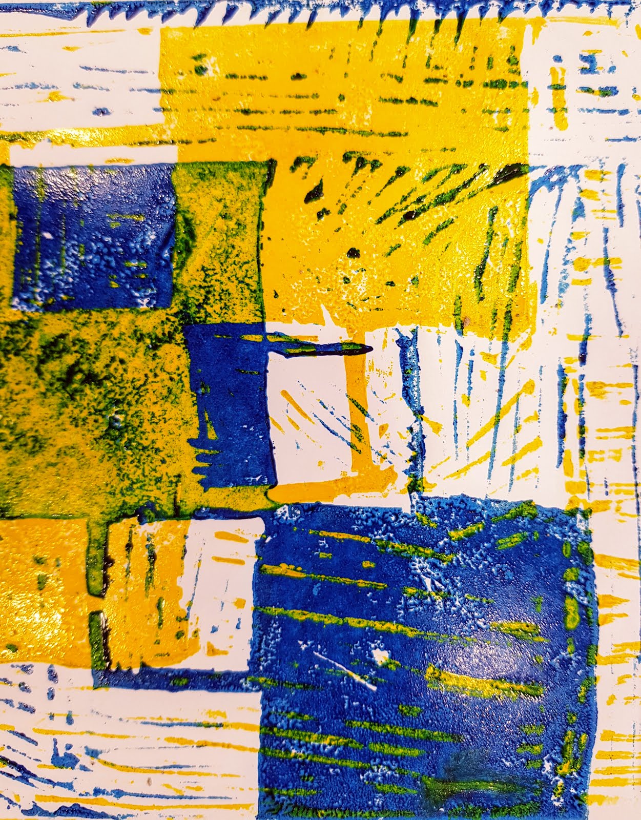
- registration - transformation - rotation - repetition (these are all mathematical terms too!)
The first point to think about is colour choice. Eventually I want lots of experimentation from you, but to begin with, choose one contrasting colour pair to work from.
When I showed you printing the first one which was"registration", I blotted the purple before I printed the yellow over top. After experimenting, I am recommending that you DON'T do that, print wet on wet, as it gives another effect to your work that might be more interesting.
This is done with hand printing (not a press). We use a metal spoon to burnish the back of the paper until the print comes through. You need to be patient and careful not to slip. The spoon will heat up because of friction, slow down when that starts to happen.
Registration:
Rotation:
Transformation:
Repetition:
Everyone needs to be printing by Friday, please don't forget your plates and tools for tomorrow.
On Friday we worked through an exemplar 'how-to' in acrylic painting.
Acrylic is different to watercolour. Watercolour should be watery. Acrylic should be strong and layered.
Key technique points:
- Start with a very basic pencil sketch - no tone, light lines.
- Key in base colours in thin watered down paint - preferably use a clear gel medium to thin the paint down.
In the cupboard above the sink. Don't use heaps, just a little.
- Use colour theory to sort your base colours - cool tones look far away, warm tones look closer to you. You are an illusionist with painting.
- Once you have your base colours down, then you need to determine where the lights are and where the shadows are. NEVER use black paint at this point. If you really need it, use it at the end of your painting process, to strengthen the darkest areas only if necessary.
- To mix a 'block' colour or dark shadow colour, look at the paints you have and select the darkest hues from opposite sides of the colour wheel and a tiny bit of yellow. That will usually result in a good dark tone.
You don't need every colour in the universe on hand to paint, just the basics: red, yellow, blue, a nice clear purple helps (or magenta) and white.
Build your paint up and paint with thicker paint than you would if you were using watercolour. less water and less paint is actually what you need. too much paint and you wont be in control. Same with too much water.
You will be looking to build up careful layers, so if it's not quite right, so long as you haven't used too much paint underneath, you should be fine:
On Monday and Tuesday, we will work through a couple more painting exemplars and add to this resource too. If you want to keep practising basic shapes like this, remember to KEEP all your attempts as they are NCEA evidence for 1.2, 2.2 and 3.2.
1) Our learning outcome has been:
to develop an understanding of Sonja Terk Delauney, Orphism and colour theory through lino cut printmaking. We should also be cementing our understanding of leading lines and focal points in completing these.
2) Our techniques we have been using have been: Practical knowledge research drawing of terk Delauney's work.Understanding context and Communicating and Interpreting: research information on Terk Delauney on our blogs. Developing Ideas: Thumbnail sketches with colour and annotations, refinement of an idea in colour with annotations. Practical Knowledge: lino cut mark making - two layer plate from one design.
3) The evidence you can provide would be photographic - your work pages to date and your lino plates as they are right now.
4) What worked: completing thumbnail sketches in front of you and explaining leading lines and focal points as I went. I would do this more next time in teaching you. What didn't work: not having a lino print ready to show you before you started the thumbnail sketches, as I think that messed with your heads a bit when I then said take one design and turn it into two plates.
I believe you have a good understanding of the geometry and play with shapes required to achieve the look we are going for with Orphism. Many of you connected really well about making focal points and leading lines a reality in your pieces. i will be working more on colour theory with you next week.
The five paragraphs above were written to this structure. It is also on the Tohatoha section of semester one. USE it as an example and USE it to help guide your writing.
You should have the first piece of panel one sorted.
can you evaluate where your work is going and whether it is disjointed?
The Mahi work sheet is important to me as it helps me know what is happening, even if you are too shy to share or unsure how to say it aloud.
You can customise it any way you want.
If you haven't already, make a copy of this and share it back to me. I will keep asking.
The way you read one series into the next is vital in Level Three.
There are three breakdowns of Level three folio criteria now on your waihanga section that will also be printed out for you. please save a copy to your own drive.
As the year progresses, I would like you to be taking a section of the excellence criteria and/or explanatory notes and making this your focus for a few weeks. This is a way of embedding the very best practice into your work.
Last week you all have the opportunity to spread your work onto your panel one and see it as it will potentially look at the end of the year.
In some cases that meant that i went into your sketch book and pulled out work you didn't realise would be eligible for the folio standard.
Keep in mind that your first series of works should be an introductory statement - like in an essay.
Alayna has structured hers across the top of panel one. the strong elements of shadow, and dark contrast, with the red lettered words, would be things I would expect to see her continue to use and evolve as her folio progresses. even if it is not the same as her original plan. It is better to have the best work over the 'right' work. Art should evolve.
Olivia has larger pieces that she hasn't formatted to fit properly yet. her water colour pieces would need a few more layers and line work based on her artist models. I would expect her to use her less successful pieces on the left to trial these ideas out. Trimming her work up and figuring out how they would sit when glued down is also a consideration to make.
In both cases, filling up the board, making sure your 'why' is visible, and producing work systematically (not randomly with no connection) is important in achieving the standard.
Your instructions were to post these photos following feedback from me onto your own school blog:
- Title your post
- Use Art as a label
- Spell check with me if needed
- PUBLISH the post
Following this, I placed an expectation on you to peer assess each other on your blogs. I notice that many of you didn't have the blog post in place to be able to do that, As this is going to be something we do ongoingly, you will need to adapt and manage your blog posting better n a lot of cases.


 - Use colour theory to sort your base colours - cool tones look far away, warm tones look closer to you. You are an illusionist with painting.


